I use a scrapbooking program from Lumapix called Fotofusion. What I am about to talk through is only a small set of the ways this software can be used. I highly recommend going through the tutorials and information. It's fun!
First I determine what size page I want to make. This depends on what I am going to do with it and where/how I will print it. Usually, I'm making 8.5 x 11 pages to go into the yearbook. I also set up the page to have a half inch border all around as a 'safe area'. This reminds me not to much closer to the edge to eliminate any issues in printing or not being able to view everything in in middle of the book (especially since I don't want to crack the spines).
I select the pictures I want to start with and place them randomly on the page.
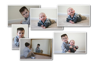
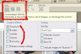 Fotofusion has a great tool - Autocollage - that will automatically place the pictures, using the original size of the pictures. I can ask it to fill the whole page or leave some space (Sparse option), ask it to rotate the pictures a bit (Jumble), include borders or shadows or not. For most every page I start with filling the page using borders and shadows. I can keep hitting the Autocollage button to get different layouts. Here's one option.
 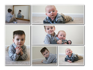 Next let's resize the pictures to fit better and make a space for some text. I like the layout of the pictures on the bottom and the left side so will leave them alone for now. But I'd like to have a picture of the baby that is the same size as his big brother. And that means resizing it and the picture of the two of them.
 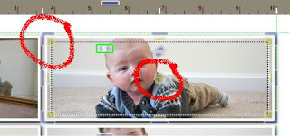 When I click on a picture, I get yellow squares with a dotted line on the inside of the picture. And I get clear/grayish things (technical term there) on the outside. The clear/grayish things are for moving the outside of the picture, resizing it on the canvas. The yellow squares allow me to zoom in and out on the picture. It's hard to show you how these two things work in pictures, but the tutorials have videos that show it easier. The yellow star in the middle of the picture moves the picture around inside the frame. So once the frame is resized, I can move the picture left or right, zoom in or out to make it look like I'd like.
 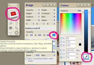 Now let's get a little more creative. Let's add some color to the page, starting with the background. The majority of my pages have color in the background that is a color in one of the pictures. I do this using the color picker - another awesome tool! To get to the background, I click on the blank space between pictures. I then click on the Frame Image choice (in red) in the tool box. Up pops the Image toolbox. Since we don't have an actual image there, not much else will do anything yet. I then click on the color box and up pops the Colors toolbox. To pick a color in my photos, I click on the color picker (eye dropper looking thing) and move it around to the different parts of my picture to decide what color I like for the background.
 I can do the same thing with the picture frames, changing them from white to another color. On the Frames toolbox, I can also change the width of the frame or change it to circular or some other shape. But for now, I'll just leave it as it is, changing the color. Which is what I do the majority of the time on my pages.
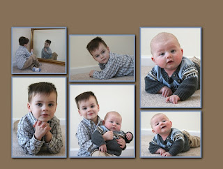 Time to check in where we are on the page. Here I resized the two pictures we talked about, zoomed in on the picture of the baby and moved a few things around so that I didn't have complete symmetry (which is an improvement for my engineering brain!). I left some space at the top (hard to see with the white background) to put some text. I picked a tan for the background from the baby's pants and a light blue for the frames from his brother's shirt. I used the very cool tool Replicate tool (looks like an equal sign on the top of the Frame toolbox) to make all the frames the same.
 Lastly I am going to add some text. I click on the background and then the T button in the main toolbox. The Font toolbox pops up with a box at the top to write my text. I type it in and select the color I want with the color picker. I also have many choices for which font to use. My two main choices are Comic Sans MS and Kristen ITC but I like to use others just to spice things up sometimes.
Here's our final product. I made a few changes, resizing and moving the pictures to make it fit better with the text.
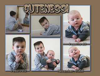
It's fairly plain, not alot of embellishments or flair. But that's okay. That's what I like. Besides what else would you really want to say or do with this page? The goal is to show off the boys. I could do more journaling about the photo shoot or some fun facts about the boys, but really, what I'll want when I look at this in my book is to remember them. To bring a smile. And that's what we have here.
The purpose of my scrapbook is to showcase the people and the things, NOT my scrapbooking. You can see from some of my other pages that I do add more text, colors, different frame styles, papers, etc. The choices are endless.


7 comments:
You should do this for a living for people who do not have the patience or ability.... you are very talented!
Good job with the tutorial, Michele!
Michele - how nice of you to make pages for your sister. Tell her those kids are adorable! So sweet!
Shana
Literarily
SJ - I don't know how that would work. It's so personal as to what is important to folks or the journaling and such. I've thought about it a bit but just don't know how it would work. Thanks for the compliments though! I love those. :-)
Julie - My teacher!!! You would have written a better one.
Shana - That page is for MY book! LOL I took the pictures over Thanksgiving and that page is mine. I did make an announcement and Christmas card for my sister and will give her the files on cd but not sharing the page. Nope! LOL
This series has been fantastic! You are awesome!
Wow you are very creative. My daughter enjoys scrapbooking but the extent of mine has been putting pics in a photo album!
what a great series of posts, Michele!
I used Creative Memories to make several scrapbooks, but haven't done anything for a few years.
When I get the time (ha ha!), I'd like to explore the digital scrapbooking -- your pages look fantastic!
Post a Comment